Take a look at your entire business
A dashboard provides a holistic view of a given business area. It is more than just a report and is often presented in a tabular form. Simply speaking, it is a window. Its usefulness depends on what is going to be presented and how. To be specific, which reports are going to be shown. A dashboard is a set of selected reports which the user sees on the screen at the moment. It allows to easily compare various data on a single screen.

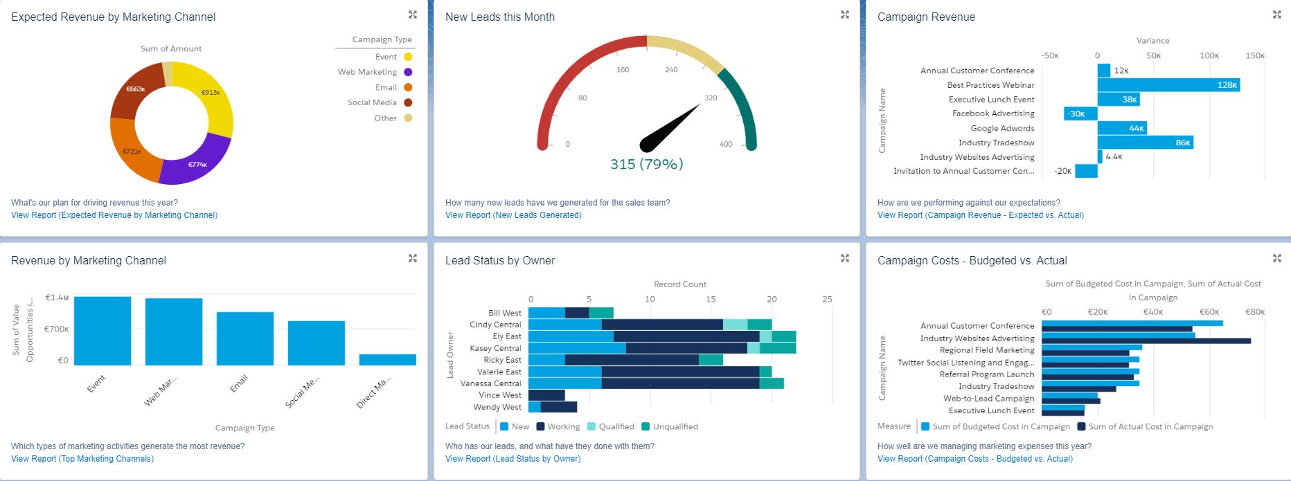
Image – Marketing dashboard.
Creating dashboards is, to a certain extent, like block building. The user decides which blocks (that is reports) will built a given structure There can be even 12 blocks in a window view.
What does it look like in practice? In the “Edit Dashboard” field, you can change the dashboard’s name or the size of window, and add or delete specific elements. When you select “Add Component”, a list of reports available in the system is displayed, and you can select those which will be added to the view of your window. You can also decide in what graphical form the data will be presented (bars, tables, etc.).
Global filtering is also helpful. In the case of a dashboard covering the whole sales team, you can, for example, use this filter to narrow the view down to a specific sales person and see only the data related to them.
Decide what you want to analyze
The tool is attractive from a visual and technical point of view — it is easy to use, and definitely intended for business. However, it is dashboard content that decides whether it serves its intended purpose. Building dashboards can be compared to creating pivot tables in Excel. To build reports and a dashboard out of them, you need to understand data dependencies (show me A if B=C). However, you still don’t need technical knowledge.
Besides, it is worth answering a few questions at the very beginning.
· What indicators do I want to analyze?
· What for do I need this?
· Which of them do I really want to have within my sight, that is on the dashboard?
· How important for me is quick access to specific data — do I need it to make current business decisions?
Let’s use the following example. One of typical KPIs measured in sales is sales people performance, that is having their work time accounted for. It’s an important indicator but its significance my vary depending on the type of business. For a company working on a project basis — such as Craftware — it is not a key indicator. Sales people activities (for example the number of phone calls to clients) does not translate directly and significantly to sales performance since Salesforce implementations are usually — from the sales point of view — long and multi-threaded processes.
But it doesn’t mean that a sales manager in a company whose profile is similar to that of Craftware will completely give up following this KPI. They will rather not put a report illustrating this KPI on a dashboard because this indicator is not decisive. They will check this data in the system if required, for example if there are doubts about a specific sales person and his proactive approach to clients.
In this case, other KPIs, such as the value of potential project or project margin, are more important for the manager — putting this reports on a dashboard may turn out to be helpful in making current decisions. This kind of data also allows to measure the client’s value (project value vs. costs) so it will be also used by Delivery and Product Managers, CFO, or CEO.
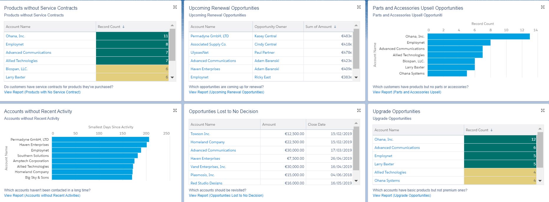
Obraz – Sales dashboard.
Work in real time
Salesforce enables you to work with data in real time – this is also the reason why dashboards are such a valuable analytic tool. Each new piece of information entered to the system or data update is visible on the dashboard right away but please remember that this applies to situations in which data comes directly from a Salesforce database. If it is transferred to Salesforce from another system (for instance financial values from a finance and accounting or ERP system) in various periods, dashboards are updated after a given period or at a specific time scheduled according to the created integration.
Find a dashboard for you or design it yourself
There is no single formula for a perfect dashboard. MyTrailhead – a collection of Salesforce tutorials, which is an innovative and interactive e-learning system, is a proved source of knowledge about this tool. It helps both beginners who build their first dashboards, and advanced users who want to use the dashboards even better to streamline their daily work with huge quantities of data.
Moreover, at AppExchange you can find dashboard-related applications, also in the form of dashboard templates. They are not universal but if used in an industry or business model similar to the one for which they were designed, they might turn out to be helpful.
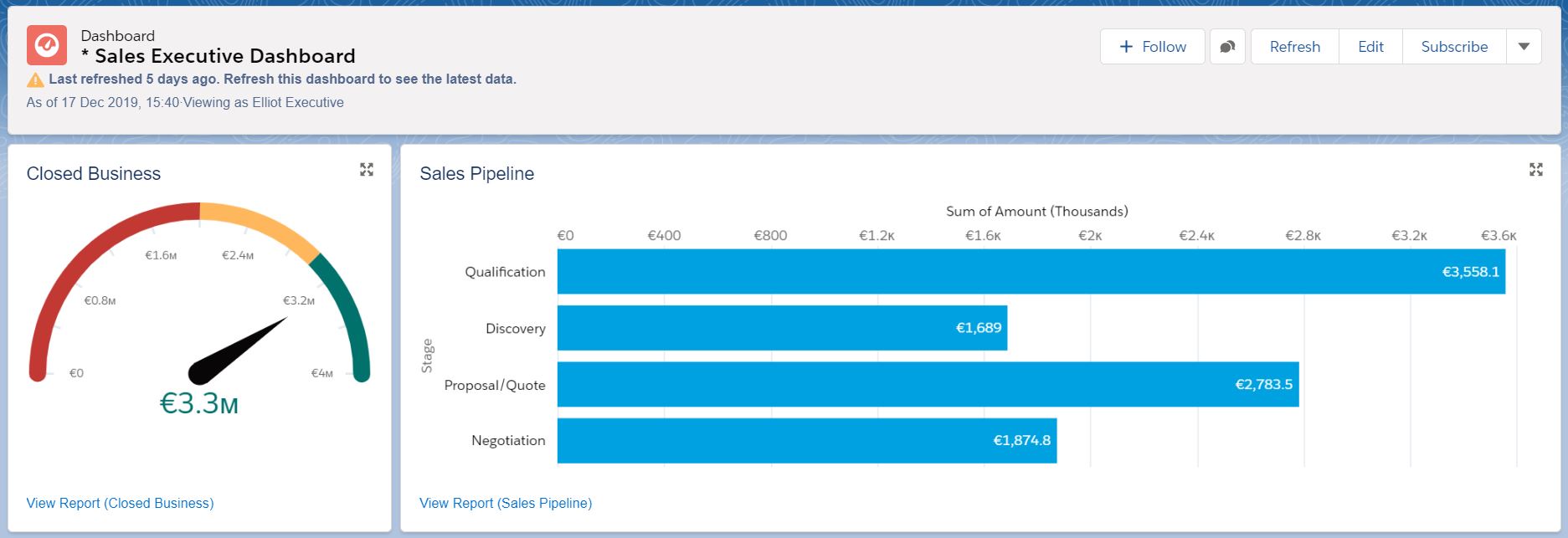
The Salesforce platform also offers a set of ready to use reports and dashboards within out-of-the-box solutions. Sales Cloud, a solution dedicated to sales departments, provides three main templates: dashboards for a sales person, manager and sales director — we will describe them in the article to come. We will also present examples of our own dashboards.
Image – Sales Executive dashboard.
- Sales Manager | Salesforce for Business
-
A SaaS (Software as a Service) sales and business development expert working on the Polish and international markets. At the beginning of his career, his work was related to GRC (Governance, Risk Management, Compliance) systems, and then HR systems — eRecruiter (Pracuj Group). He has been working with Salesforce CRM for two years. Currently, he is leading the Craftware sales team. He is responsible for acquiring new clients, implementing Salesforce solutions at large corporations, and developing cooperation focused on customer success. He is a Salesforce Accredited Sales Professional.


